
The Union of Coffee and Mixed-Breed Dogs
Late is a visual identity project for a café that combines the warmth of coffee with the lively spirit of mixed-breed dogs. Created to challenge the stigma surrounding these animals, Late celebrates their resilience and affection while raising awareness about adoption and animal welfare. Through thoughtful design, the brand captures the dynamic balance between chaos and comfort, transforming the café experience into a space for empathy and social change. This project was developed as part of a Graduation Project in Visual Communication Design at ESPM.


If People Aren't Unidimensional, Why Should Brands Be?
Late is inspired by human complexity and mixed-breed dogs, which, like us, have moments of intense energy and others of calm. The brand embraces this duality, reflecting the idea that life is made of contradictions – between chaos and comfort, two essential elements of the human experience. This duality is reflected visually in the brand identity.
With two distinct color palettes, one more vibrant representing chaos and another softer representing comfort, Late conveys this coexistence in a harmonious way. Additionally, two logos were created, each representing one side of the brand, and a main logo that combines both elements, symbolizing the balance between the forces. Late does not aim to be unidimensional, but rather a brand that celebrates the complexity of its consumers. With a visual identity that blends energy and comfort, the brand offers a space where chaos and calm coexist, reflecting the reality of those seeking a laid-back refuge amidst the hustle and bustle of everyday life.

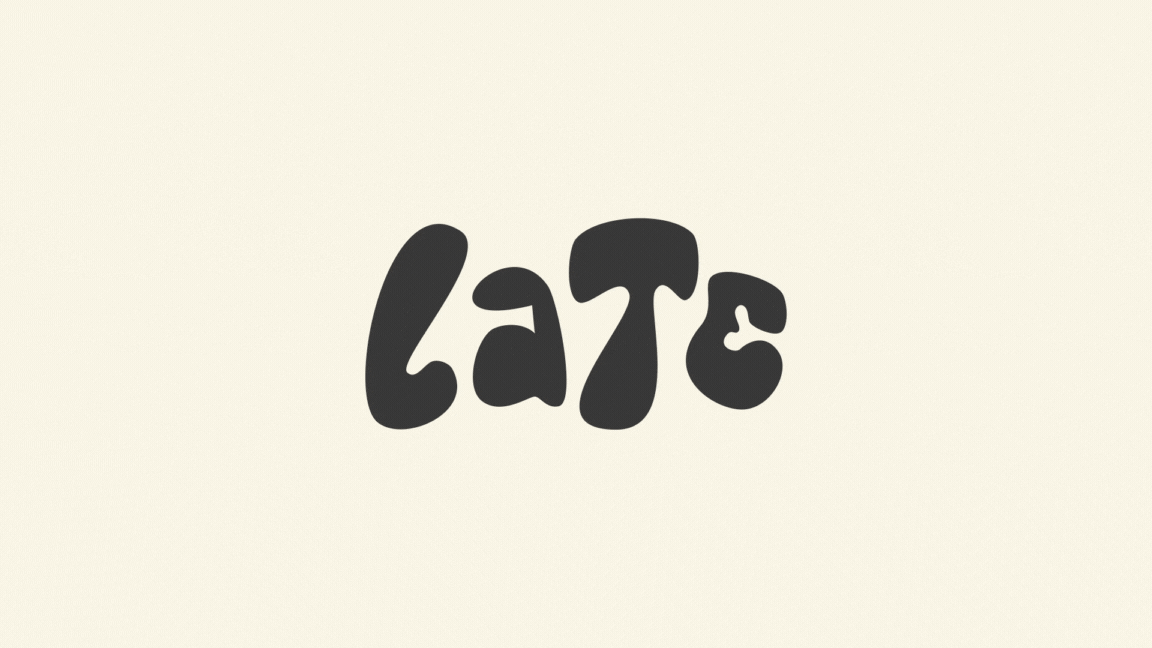
The creation of the logo
Involved subtle references to the canine world, resulting in a visual identity that goes beyond conventional typography. The letter "E" incorporates a bone in negative space, making a discreet but impactful allusion to the animal world. The "T" was inspired by the nose of dogs, with its rounded shape and more pronounced upper part. The letter "L" continues to be inspired by the tongue, while the "A" references the tail of dogs, with a curve at the top. The union between chaos and comfort is also visually reflected in the logo. The upper part of the letters has more pointed forms, representing chaos and energy, while the lower part is rounder, conveying comfort and softness.
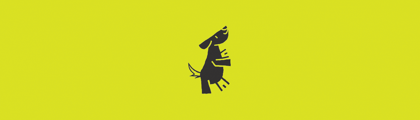
This contrast between the upper and lower sections reinforces the brand's duality, embracing both chaotic movement and warmth, translating the essence of mixed-breed dogs and the brand in a visually cohesive way. The illustrations that accompany the visual identity were also inspired by the logo and the typical positions that dogs assume. Postures such as relaxation or excitement were translated into shapes and lines that complement the logo, creating a visual continuity between the typography and the illustrative elements. In this way, the illustrations reinforce the idea of chaos and comfort in an organic and playful manner.


2024
Academic project
Visual Identity / Branding

