
20 years, one identity
For the 20th anniversary of the Design course at ESPM, Rio de Janeiro—a renowned Brazilian college focused on creative industries—the school challenged our Emotional Design class to create a brand identity to commemorate this milestone. The goal was to develop a visual system that would reflect the course's and the Rio's design history while supporting a series of celebratory events, including workshops and lectures.
Among the proposals created by the class, this visual identity was selected to officially represent the anniversary. The development process began with an exploration of Brazilian design, particularly within the cultural and creative context of Rio de Janeiro. Research highlighted the significance of resourcefulness and adaptability—concepts often associated with the Brazilian approach to problem-solving. This perspective resonated deeply with the essence of design itself, which is fundamentally about creative solutions.
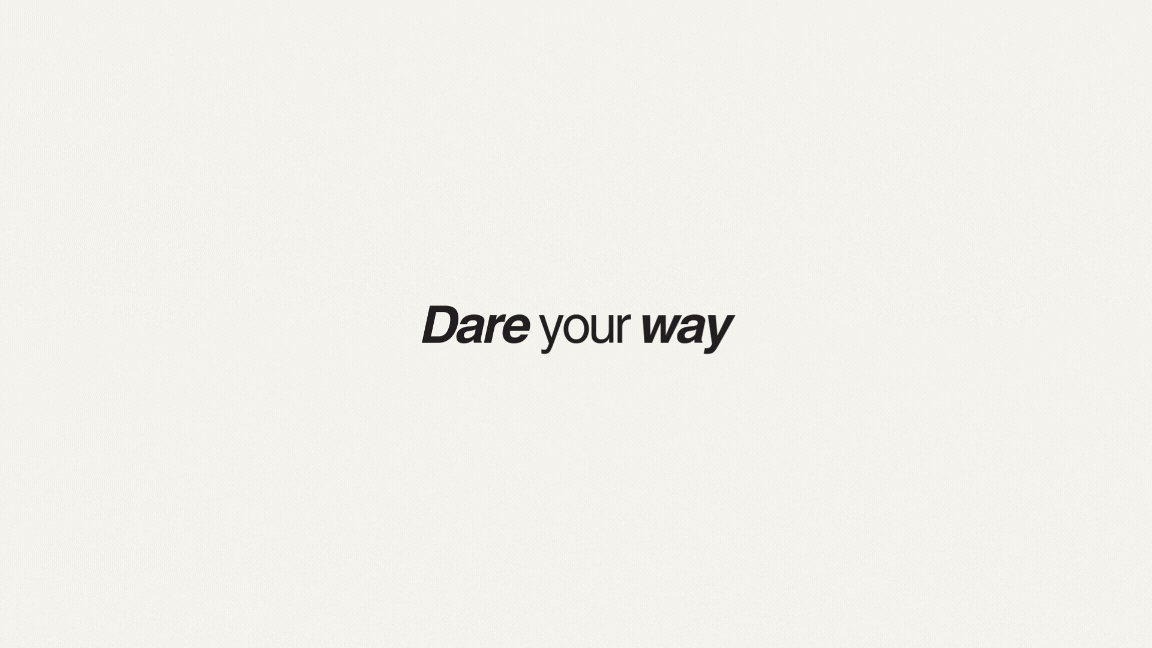
To align with ESPM’s philosophy—centered on daring, innovating, and thinking outside the box—the tagline "Dare Your Way" was created. This phrase merges the boldness inspired by ESPM's mission ("Dare") with the resourceful and personal spirit of the Brazilian way of being creative ("Your Way").


Filling in the blanks
This identity was designed to be dynamic and interactive, reflecting the boundless possibilities that design offers. Central to this concept was the use of the number "20" as a blank canvas. The empty spaces within the numbers symbolized the open-ended potential of creativity, inviting students and participants to actively engage with the design.
This idea of interactivity was implemented in several ways. For instance, on tote bags, the blank areas of the "20" allowed students to literally draw and fill the space as they wished, creating unique, personalized pieces. Beyond this participatory element, the identity also experimented with the negative space of the "20" by incorporating various design elements. These elements represented both the world of design and, more specifically, the realm of digital creativity, tying the concept to contemporary design practices.
The visual language was further enriched by a vibrant color palette, inspired by the energy and diversity of Brazilian and Carioca culture. Additionally, the orange tone—associated with the Design course at ESPM—was incorporated to root the identity within the institution’s visual tradition, ensuring consistency and recognition.


2023
Project for ESPM
Visual Identity

